Tuesday, October 5, 2010
Design Success and Failure in Relation to Syntactical Guidelines
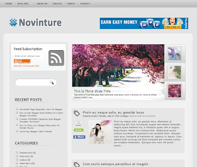
Because web designing is an area of interest for me, I find it important in creating layouts that make it easier for viewers to see since many individuals use the internet on a daily basis. This is an image of a blogging website that puts the syntactical guidelines to good use. There is a certain level of balance here in which the format is simple and easy to follow, but at the same time there is relative stress in which the section where blog entries are posted take up more space in order to focus the viewers' attention on that. On the left side of the layout, grouping is used to categorize similar interests, topics, and links to make it more convenient to navigate.
This website layout clearly has a lot going on that could confuse the viewer. Just by glancing at it, I myself wouldn't know where to look first as it lacks a format that can guide viewers. The chaotic appearance follows the syntactical guideline of stress. It is the complete opposite of balance, which conveys simplicity, regularity, and harmony. Although stress can be attention-getting, the fact that it is uniform in this layout makes it difficult for one to be interested in navigating the website. For successful web designing, one should create it in a format that makes it convenient for a viewer to access a website.
image citations: "http://www.bloggerblogtemplates.com/"
"http://www.jamesvandyke.com/2008/01/11/worst-website-design-ever/"
Subscribe to:
Post Comments (Atom)


No comments:
Post a Comment