Tuesday, October 26, 2010

Dimension/Depth/Space


      In graphic design, there are various depth cues that can be found within an image. Here, you can find an overlap. In an overlap, the object that covers another object is perceived as the one closest to the viewer. The interposition of the two left individuals standing in front of the buildings show that they are within closer proximity than the buildings. You can also find relative size in the individuals. The person on the right is bigger in size, therefore taking up a bigger field of view. This gives the impression that this person is standing closer to the viewer in comparison to the other two individuals who are taking up a smaller field of view. Lastly, you can find relative height. This depth cue gives the illusion of distance between objects. Here, the buildings are placed above the horizontal line, making the individuals look as if they are far away. The same is said vice versa in which the individuals that are placed below the horizontal line make the buildings look as if they are far away.

image citation: "http://www.pirsquared.com/"

Tuesday, October 19, 2010

Tone and Color


      Because I am interested in graphic design, I chose this typography artwork that contains both tone and color. Here, tone creates perception. The usage of tonal range shows shadowing around the edges on the right side of face, almost indicating that there is a light source coming from the top-left side of the image. Therefore shadow can indicate the positioning of an object. It is also evident in her sunglasses which happens to be facing downwards. The tonal range also adds more details to the woman's appearance. Here, it distinguishes the shape of her nose and eyes. Tone has a relationship with dimension. The variation in lightness and darkness that you see in the woman's face makes her seem more real by making her facial features pop out, such as her nose and eyebrow bone structure. If it weren't for tone, there probably would be no dimension, making the woman appear to look more cartoon-like instead of an actual person. Therefore tone is necessary in order to create the visual effect of a 3-dimensional illusion on a 2-dimensional medium.

    Color is used as a pop-out effect in this artwork. As humans are naturally drawn to things that catch attention, the color purple is used to catch the viewer's attention onto the woman's appearance. Color may also be used to convey emotion or come attached with a meaning. Although emotion and meaning can vary from person to person, it will still convey some sort of interpretation. For me, when I see the color purple on this image, I interpret it as expressing a sense of fashion. And that is due to the fact that the purple is visible in her makeup (eyeshadow & lipstick), her nails, and sunglasses. Color has a relationship with tone. Although color is not necessary in getting a message out as tone can do the job by itself, color does fulfill the decorative aspect of tone. Here, the color purple builds a richer visual effect to draw a viewer's attention. The varied shades found in color creates more tonal options for a user to add in a design compared to just grey tonal range.

Sunday, October 10, 2010

Web Design


TEXTURE:   Texture is generally a substitute for the sense of touch. In web design, its purpose is usually to get attention and be visually appealing to the viewer. In this image, texture is evident in the background of the page (wooden floorboard appearance) and within the templates (aged paper look). Even though viewers can not touch the wooden floorboards or the paper, it gives the illusion that they almost can do so. This creates a sense of realism and adds more depth to an otherwise bland, 2D website. Texture can also add to the overall theme of a website. Here, the combination of the wooden layout in the background and the aged paper appearance within the templates project a sort of "Old Western" feel. There are endless styles of this element that can give more variation to appearances. Hence, texture has a lot to do with aesthetics when it comes to web design.


DIRECTION:   In web design, direction provides a sense of navigation or guidance. In this image, the element of direction is found within the way the content is laid out. The positioning of content is formed in the visual direction of horizontal-vertical. The text is presented in a way for the viewer to read topics from top to bottom (vertical), while the photos at the bottom and the navigation links at the top are scanned from left to right (horizontal). Not only does this create a visual rhythm, but the horizontal-vertical direction is associated with the idea of stability, which is quite fitting with web design. When one looks at a website, they want to be able to view the content with no complications or inconsistency. The way things are organized is vital in getting information out towards the viewers.


LINES:    Lines can be found in various ways: forming shapes, creating direction or movement, and developing symbolic notation. In this image, lines are used for structure in web design. At the very top, the navigation buttons are divided by the illusion of lines while the links at the foot are divided by actual lines. Even the headliner before each reading content is sectioned by lines. This division gives a clear cut definition of boundaries, allowing the viewer to see how things are categorized and organized. Lines also create shape. Here, they form boxed shapes which define boundaries as well. Such bordered shapes created by lines organize relevant information into sections of space on a website. This helps viewers see where one topic begins and ends, therefore showing the importance of giving out information in a clear, concise manner. This is quite similar to the element of direction.

Tuesday, October 5, 2010

Design Success and Failure in Relation to Syntactical Guidelines


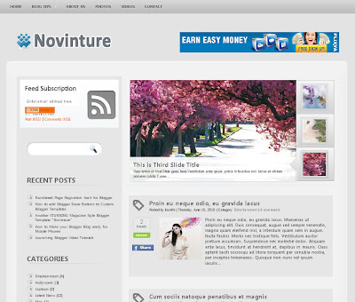
      Because web designing is an area of interest for me, I find it important in creating layouts that make it easier for viewers to see since many individuals use the internet on a daily basis. This is an image of a blogging website that puts the syntactical guidelines to good use. There is a certain level of balance here in which the format is simple and easy to follow, but at the same time there is relative stress in which the section where blog entries are posted take up more space in order to focus the viewers' attention on that. On the left side of the layout, grouping is used to categorize similar interests, topics, and links to make it more convenient to navigate.


     This website layout clearly has a lot going on that could confuse the viewer. Just by glancing at it, I myself wouldn't know where to look first as it lacks a format that can guide viewers. The chaotic appearance follows the syntactical guideline of stress. It is the complete opposite of balance, which conveys simplicity, regularity, and harmony. Although stress can be attention-getting, the fact that it is uniform in this layout makes it difficult for one to be interested in navigating the website. For successful web designing, one should create it in a format that makes it convenient for a viewer to access a website.


image citations: "http://www.bloggerblogtemplates.com/"
                        "http://www.jamesvandyke.com/2008/01/11/worst-website-design-ever/"