Tuesday, December 14, 2010

Interactions Between the 3 Levels


This is an image of a mood board for web design that incorporates all 3 levels.

REPRESENTATIONAL:

The mood board shows images of actual objects in real life. The items shown under "profile images" are considered representational as they are direct objects that you would see in person. They are direct reporting of a large amount of details. The representational "profile images" help a person in terms of simply being used as a visual aid. As we are all visual beings, perusing through a website creates more interest if we see such images. They relate to the other levels as they can be abstracted into simpler terms or even distilled to a symbol. 

ABSTRACT:

The "background" of a website can be considered abstract. Various designs for a background can be distilled into simple and basic elements, such as geometric patterns. Without the abstract aspect applied, the background can be either be too distracting or too plain. Sometimes abstract items in an image displayed on a page are just simpler forms of the representational. They keep out unnecessary details and keep the important details in, which is usually what a viewer would like to see when viewing a website.


SYMBOLIC:

The "style ideas" of a website can be considered symbolic. The letters we read that form words are quite symbolic since they are used as a source of communication. Also, icons that are displayed on a page signify some sort of meaning. They generally will use representational information to communicate that meaning or message.

Tuesday, December 7, 2010

Representational, Abstract, & Symbol


     This image is of a jewelry holder designed in the form of a turtle. The jewelry holder is an example of the representational due its recognizable form of an animal, the turtle. Based on our experiences we have seen what turtles look like, therefore making this image easy to distinguish such an animal. As the representational depicts an image containing a lot of detail, we are able to see here the distinct features of what we know makes a turtle. The representational turtle form is used both as an expressive and functional design. Its functional purpose is to hold jewelry while its expressive purpose is to look aesthetically appealing.


     This is an image of a landscape viewed from possibly a window. The landscape art is an example of the abstract because it has taken all the details from the representational and simplified it. The simplification is much like distillation in which all the unnecessary details were taken out to emphasize the important features. Here we see the sun and the surface area of the land. The abstract has broken the image down into the basic elements. Here we can see the basic elements of shape, line, color, and direction. Therefore we can see the abstract understructure of the landscape. We see the composition compared to the detailed representational.


     This is an image of a well-known symbol, the peace sign.  The peace sign is seen as symbolic as it is both simplified and abstracted in order to conveniently get the message out towards the viewers. The peace sign in its basic structure is shaped as a circle. Generally shapes come associated with an attached meaning. Here a circle is a sign of protection, warmth, and endlessness which fits accordingly to the idea of peace. It is also seen as an iconic symbol as it comes with a certain amount of cultural history. It actually consists of the letters "N" and "D", meaning nuclear disarmament. As far as cultural history goes, the peace sign originated with the British nuclear disarmament movement.

Tuesday, November 16, 2010

Visual Techniques

-Transparency
-Economy
-Stasis
-Simplicity
-Consistency
-Subtlety


-Active
-Variation
-Intricacy
-Spontaneity
-Boldness
-Opacity

     As I am interested in the field of graphic design, there are various visual techniques that can be utilized in getting a message out towards the audience. These two images portray a similarity in the sense that they are both trying to reach out towards their target audience, yet they have quite contrasting visual techniques to do so. In the first poster image, we see a use of transparency with the blue and red circles in the middle. This contrasts with the second image in which it contains opacity with its many objects overlapping one another on top of the woman's head. Simplicity and economy is evident in the first image because it is frugal with its use of elements. The same font is being used throughout the entire poster and the use of intricate design is nonexistent, unlike the second image which contains a variety of decoratives. The first poster image lacks a sense of movement, a technique that is found within the second image. The colorful rainbows and musical notes both shoot out in varying directions to indicate such movement. While the first poster is subtle with its design, the second is more bold and spontaneous which is likely to grab more attention from its viewers. In conclusion, while each image contains opposing techniques, they are share a common concept of utilizing visual techniques that adapt to a certain theme or idea. The first poster is trying to get people to attend an event that may not be as flashy as a "musical engima" that is being expressed in the second image.

Tuesday, November 9, 2010

Week 11 Contrast


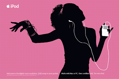
     As I am interested in graphic design, I found this well-known iPod ad to be a good example of contrast. This image represents a contrast of color to tone. The black silhouette of the woman, the white iPod, and the pink background all contrast with each other. Although you would think that the pink colored background is what provides a pop-out effect in comparison to the black and white of the woman and iPod, it is actually the iPod that pops out in this ad. The white iPod and earphones stand out against the silhouette and pink background. This technique is used so that the viewers can focus their attention on the iPod, therefore making it successful in luring consumers to buying the product. If they had shown the actual woman instead of her silhouette and a busy patterned background instead of a simple colored one, the ad wouldn't have been as effective.


     This image was quite difficult to decipher at first. In the center, the phrase "Bad Vibes" is set out in yellow coloring. It appears that the designer was attempting to use contrast in color. Yellow shades of the phrase "Bad Vibes" was supposed to be used as a pop-effect compared to the rest of the design, which is set in orange, red, and pink shades. This did not really work since the designer utilized all warm colors. Because of that, everything in this image looks so similar that it would be easy to miss the "Bad Vibes" if one were to quickly take a glance. Perhaps if the designer had used cool colors, such as blue or green, to go against the warm colors, it would've made the pop-out effect of the phrase more evident and sharpened the visual statement.

Tuesday, November 2, 2010

Implied Motion In Design


     In a photo, an action or movement can be frozen in time. But when it comes to graphic design, the designer can create a concept of trickery to lead the viewers to assume something that actually isn't happening. In this photo, we see an implied motion of expectation. The person is holding out his hands to catch the pieces of paper. They appear to be floating in air with such perfect positioning without any blurred movement (The truth is they were held by pieces of string that were edited out in the finishing product). Yet it is common sense to know that they will fall into the individual's hands due to gravity. This motion of motion of expectation is relevant to the direction of horizontal-vertical.


     When it comes to web design or print, the designer wants to create something that will catch the viewer's eye. In this image, the design structure is set on a diagonal position. In terms of direction, diagonals represent stress and change. As we are accustomed to balance and harmony, this can throw off and grab the attention of the viewers. This diagonal design shows implied motion in the sense that it leads to the viewer to assume that the structure will slide downwards. Also, the font in the word "Motion" show a form of movement as well. The way that both letter "O"'s are positioned give off a wavy appearance. This wave gives off a continuous sense of movement.

Tuesday, October 26, 2010

Dimension/Depth/Space


      In graphic design, there are various depth cues that can be found within an image. Here, you can find an overlap. In an overlap, the object that covers another object is perceived as the one closest to the viewer. The interposition of the two left individuals standing in front of the buildings show that they are within closer proximity than the buildings. You can also find relative size in the individuals. The person on the right is bigger in size, therefore taking up a bigger field of view. This gives the impression that this person is standing closer to the viewer in comparison to the other two individuals who are taking up a smaller field of view. Lastly, you can find relative height. This depth cue gives the illusion of distance between objects. Here, the buildings are placed above the horizontal line, making the individuals look as if they are far away. The same is said vice versa in which the individuals that are placed below the horizontal line make the buildings look as if they are far away.

image citation: "http://www.pirsquared.com/"

Tuesday, October 19, 2010

Tone and Color


      Because I am interested in graphic design, I chose this typography artwork that contains both tone and color. Here, tone creates perception. The usage of tonal range shows shadowing around the edges on the right side of face, almost indicating that there is a light source coming from the top-left side of the image. Therefore shadow can indicate the positioning of an object. It is also evident in her sunglasses which happens to be facing downwards. The tonal range also adds more details to the woman's appearance. Here, it distinguishes the shape of her nose and eyes. Tone has a relationship with dimension. The variation in lightness and darkness that you see in the woman's face makes her seem more real by making her facial features pop out, such as her nose and eyebrow bone structure. If it weren't for tone, there probably would be no dimension, making the woman appear to look more cartoon-like instead of an actual person. Therefore tone is necessary in order to create the visual effect of a 3-dimensional illusion on a 2-dimensional medium.

    Color is used as a pop-out effect in this artwork. As humans are naturally drawn to things that catch attention, the color purple is used to catch the viewer's attention onto the woman's appearance. Color may also be used to convey emotion or come attached with a meaning. Although emotion and meaning can vary from person to person, it will still convey some sort of interpretation. For me, when I see the color purple on this image, I interpret it as expressing a sense of fashion. And that is due to the fact that the purple is visible in her makeup (eyeshadow & lipstick), her nails, and sunglasses. Color has a relationship with tone. Although color is not necessary in getting a message out as tone can do the job by itself, color does fulfill the decorative aspect of tone. Here, the color purple builds a richer visual effect to draw a viewer's attention. The varied shades found in color creates more tonal options for a user to add in a design compared to just grey tonal range.